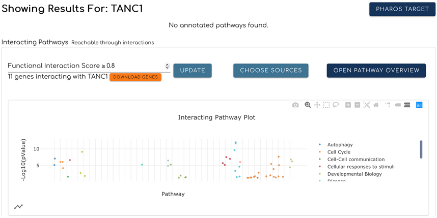
Figure 2.
Interacting pathways for a query gene or protein are displayed as a scatter plot according to the pValues of the pathways. Each dot represents a pathway and is colored based on its top level pathway assignment as annotated in Reactome. These top level pathways are shown in a legend to the right of the plot. Dots are grouped based on their top level pathways and sorted based on the original pathway hierarchy structure on the Reactome website. Clicking the network icon at the bottom-left corner switches the view to the network (Fig. 3).

