Fig. 4.
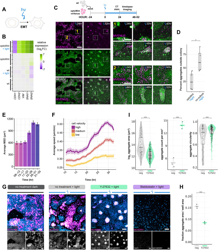
Self-organization is mediated by Wnt-induced cell migration and EMT. (A) Schematic of optogenetic induction of EMT. (B) RNA-seq heat map of log2 fold change in EMT marker genes normalized to mean gene expression of WT hESCs. Biological replicates are displayed for each condition. (C) Live-cell timelapse fluorescence imaging of optoWnt/WT co-cultures during optogenetic stimulation at the indicated time points. OptoWnt cells are labelled with mVenus-NLS expression, and all cells are labelled with CellTracker (CT) dye. Zoom in (right) of regions 1 (cell aggregation outside hESC colony) and 2 (cell aggregation inside hESC colony) at indicated time points. Scale bar: 250 µm (left); 100 µm (zoom in). (D) Percentage of aggregates forming outside hESC colonies (as shown in region 1) over total formed aggregates. Graph shows analysis of n=4 fields of view, one-way ANOVA (*P=0.034). (E) Average mean squared displacement (MSD) of single-cell trajectories of optoWnt cells in optoWnt/WT co-cultures at indicated time intervals after onset of light stimulation. Graph shows mean (>1000 tracks over 5 fields of view)±95% confidence interval. (F) Average cell speed over time of optoWnt single-cell trajectories binned by median cell velocity (low: 0-0.15 µm/min; medium: 0.15-0.18 µm/min; high: 0.18-0.6 µm/min). Data are mean±95% confidence interval. (G) Representative images of immunostaining for mCherry (optoWnt) and DAPI in optoWnt/WT co-cultures under indicated inhibitor conditions after 48 h illumination. Scale bars: 100 µm. (H) Quantification of optoWnt aggregate area normalized to imaged area after 48 h illumination under no treatment or with Y-27632 treatment. Graph shows analysis of n=3 wells, mean±s.d, one-way ANOVA (***P=0.000272). (I) Quantification of optoWnt aggregate morphology with aggregate area (log2 transformed, left, ***P<2×10⁻¹⁶), number of aggregates per unit area (middle, data are mean±s.d., ***P=0.0003), and aggregate circularity (right, ***P=5.5×10⁻⁵). Left and right graphs use the unpaired two-sample Wilcoxon test; middle graph uses one-way ANOVA. Box plots extend from 25th to 75th percentile; horizontal lines represent median; whiskers represent 1.5× interquartile range. The width of the shaded area (violin plot) represents the data density.

