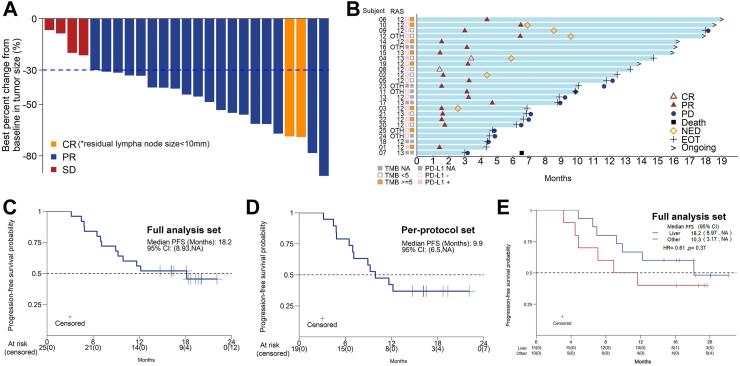
Fig. 2.
(A) Waterfall plot of the best percent change in target lesion diameter from baseline (full analysis set, n = 25). (B) Swimmer plots of patients. (C) Kaplan–Meier curves of PFS for the full analysis set (n = 25). (D) Kaplan–Meier curves of PFS for the per-protocol set (n = 19). (E) Kaplan–Meier curves of PFS classified by metastatic organs for the full analysis set.

