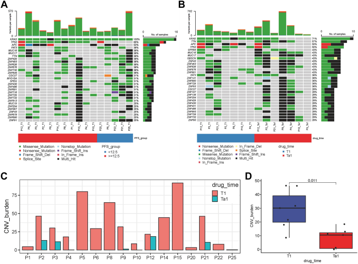
Fig. 4.
WES analysis. (A) Overall frequency of top 30 gene alterations at baseline (T1) between the PFS <12.5 (N = 5) and ≥12.5 months (N = 11) groups. (B) Frequency of genomic alterations of 7 patients underwent surgical treatment between the baseline (T1) and after treatment (T1a). (C–D) CNV burden of patients (N = 7) between the baseline (T1) and after treatment (T1a). Each point in the boxplot represents for one sample. Whiskers show the minimum and maximum of all the data. The horizontal line in the box represents the median, and the top and bottom of each box indicate the 25th and 75th percentile. The significance for differences between T1 and T1a was tested using Wilcoxon’ s rank-sum test. Statistical tests were two sided.

