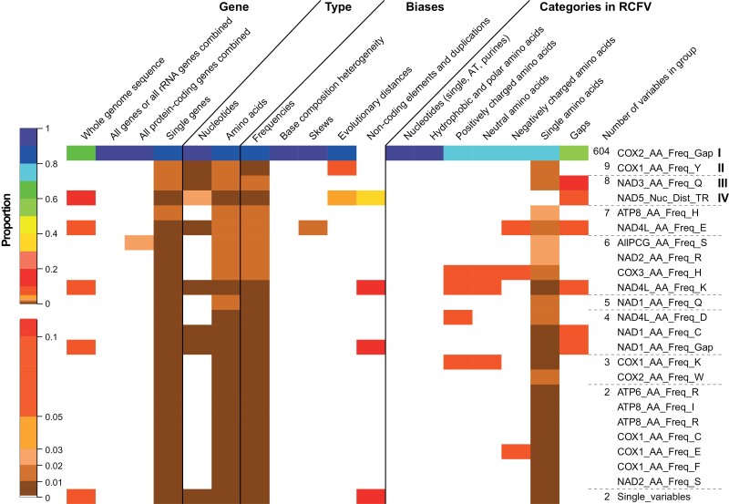
Figure 3.
Heatmap showing the proportion each group of correlated and clustered variables has for different properties shown on top. The color scheme for the heatmap is shown to the left and was done manually to capture the small differences in the low proportion range better. To the right, the name of one variable represents the group. Additionally, the number of variables within the group is indicated.

