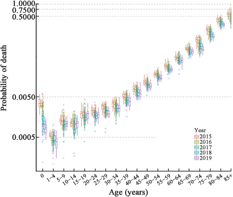
Figure 2.
Death probability distribution by age in Shaanxi Province, 2015–2019. This figure shows the distribution of death probability after the Kannisto extrapolated model by age group from 2015 to 2019. The transverse coordinates represent 19 age groups divided by the full age group, the longitudinal coordinates represent the death probability shown in a natural logarithmic scale, the box represents the upper quartiles and lower quartiles (75th and 25th percentile), the horizontal bars in the box represent the mean level, and the circles of different colors represent the scatter of jitter.

