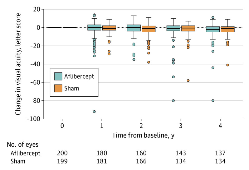
Figure 2. Distribution of Visual Acuity Change From Baseline Through 4 Years.
The horizontal line in the box plots indicates the median, the top of the box indicates the 75th percentile, the bottom of the box indicates the 25th percentile, the whiskers indicate the nearest quartile to the most extreme data point within 1.5 times the IQR, and circles indicate values beyond these limits.

