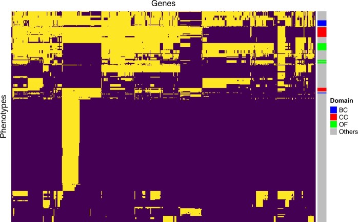
Figure 1.
Heatmap visualization of data availability in the IMPC data (release version 16) for each gene–phenotype pair. The heatmap’s columns represent the 8216 genes studied via knockouts in mice, and the rows correspond to 303 distinct phenotypes. Dark purple cells indicate missing data, whereas light yellow cells indicate measured data. Binary clustering has been used to group together measured and unmeasured gene–phenotype pairs. The adjacent color bar denotes the phenotype domain each phenotype belongs to, with “BC” referring to Body Composition, “CC” to Clinical Chemistry, and “OF” to Open Field. “Others” represents other domains. Our subsequent analysis will focus on these three domains. Notably, only around 24.4% of the potential gene–phenotype pairs have been tested.

