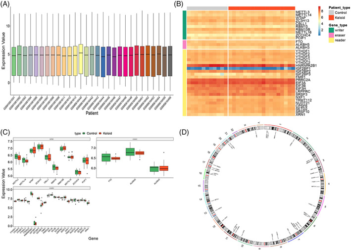
FIGURE 2.

Data preprocessing and the landscape of m6A genes. (A) Expression of m6A genes after batch effect correction and log standardisation. X‐axis is the sample, and y‐axis is the gene expression value. The center, upper‐frame, and lower‐frame lines of the box chart are the median, upper‐quartile, and lower‐quartile values, respectively. Heatmap (B) represents the expression pattern of the differentially expressed genes in the keloid patients versus that in the normal population group, and samples and different types of genes are depicted by different coloured block markers. Red and blue represent high and low expression values, respectively. (C) Box diagram of m6A genes. X‐axis is the gene, and y‐axis is the gene expression value. The sample groups are distinguished by different colours and drawn according to the gene type. The middle, upper‐frame, and lower‐frame lines of the box chart are median, upper‐quartile, and lower‐quartile values, respectively. (D) Ring diagram for chromosome location. The outer circle is the chromosome, and the inner circle is the location mark of these genes on the chromosome.
