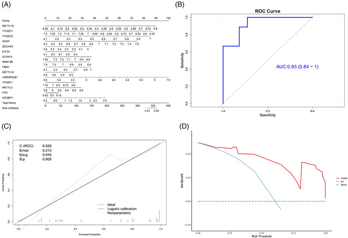
FIGURE 6.

Verification of diagnosis model based on m6A genes. (A) Nomogram chart; the left and the right sides are the prediction index and the ruler, respectively. (B) ROC curve of the model; x‐axis is specificity, y‐axis is sensitivity, and AUC is the area under the curve. C (ROC) is the area under the ROC curve. (D) DCA curve; x‐axis is the risk threshold, y‐axis is the net benefit rate, green dotted line represents 0 net benefit rate, blue dotted lines represent that all samples have been intervened, and model (red solid line) represents the model curve.
