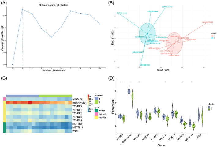
FIGURE 8.

Unsupervised clustering of samples. (A) Selection of the best number of clusters. X‐axis is the number of clusters, and y‐axis is the average contour value. Best number of clusters was selected by calculating the average contour value, and the best number is present at the maximum contour value (dotted line). (B) Dimension reduction graph of K‐means clustering results. X‐axis and y‐axis represent two dimensions, and each point in the figure represents a patient sample. These patients are grouped into two groups, and each colour represents a patient subgroup. (C) Heatmap. Grouping and gene type of the samples are marked with different coloured blocks. In the figure, blue represents low expression value and red represents high expression value. (D) Combination of box diagram and violin diagram. X‐axis is the gene, y‐axis is the gene expression value, and sample groups are distinguished by different colours. Middle, upper‐frame, and lower‐frame lines of the box chart represent median, upper‐quartile, and lower‐quartile values, respectively. Wilcoxon rank sum test was used for statistical analysis. Upper symbol represents the significance level of the difference, * represents P < .05, ** represents P < .01, *** represents P < .001, **** represents P < .0001, and ns represents not significant.
