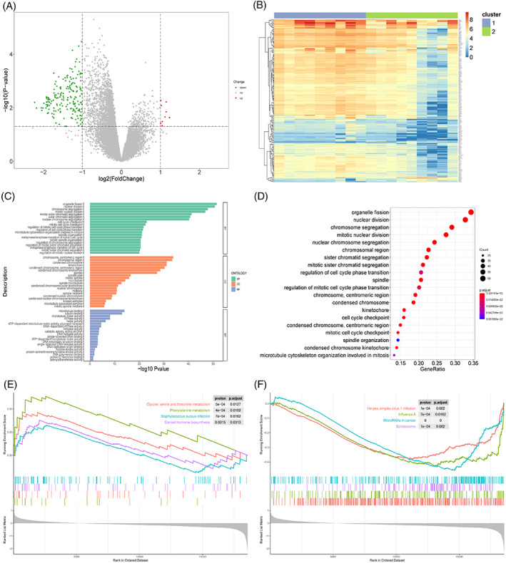
FIGURE 9.

Biological differences between sample groups. (A) Volcano map of differentially expressed genes. X‐axis is log2 (foldchange), and y‐axis is ‐log10 (P‐value). Each point represents a gene. Green, red, and grey represent downregulated genes, upregulated genes, and genes without significant change in expression, respectively. (B) Heatmap of differentially expressed genes. Upper colour bar represents two groups of samples; each colour represents a subgroup; blue represents low expression, and red represents high expression. (C) Bar graph of GO enrichment results. X‐axis represents ‐log10 (P‐value), and y‐axis represents enriched GO terms. Only top 20 GO terms from BP, CC, and MF categories are shown here. (D) Bubble chart of GO enrichment results. X‐axis is the gene proportion, that is, the total number of genes/differentially expressed genes enriched for a term; y‐axis is the name of the GO term, and the size of the point represents the number of genes enriched for this term; and the colour represents the corrected P‐value. The smaller the P‐value, the closer it is to red, that is, the difference is more significant. Only the top 20 GO terms are shown here. (E) GSEA analysis results (upregulated part). X‐axis is the rank of genes in the list of differentially expressed genes, with upregulation >0 and downregulation <0. Upper y‐axis is the enrichment fraction, and the lower y‐axis is the log2|FC| value. Each colour represents a pathway. Only the first four pathways with the most significant upregulation are shown here. (F) GSEA analysis results (downregulation part). Only the first four pathways with the most significant downregulation are shown here.
