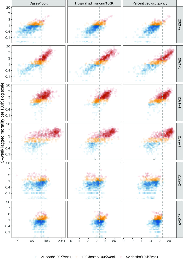
Fig. 2.
State-level lagged mortality vs. indicator levels by quarter. Columns indicate different indicators (weekly cases per 100,000 population, new hospital admissions per 100,000 population, and percentage of inpatient beds occupied by COVID-19 patients), and rows indicate quarters. The x-axis displays indicator values on a log scale, and the y-axis displays 3-week-ahead mortality per 100,000 population on a log scale. Each point on the scatterplot is a state-week. Colors show the mortality outcome level. The vertical gray dotted lines indicate thresholds from CDC Community Levels for each indicator (≥200 cases/100K/wk and ≥10 new admissions/100K/wk or ≥10% COVID-19 bed occupancy). See SI Appendix, Fig. S1 for a county-level plot.

