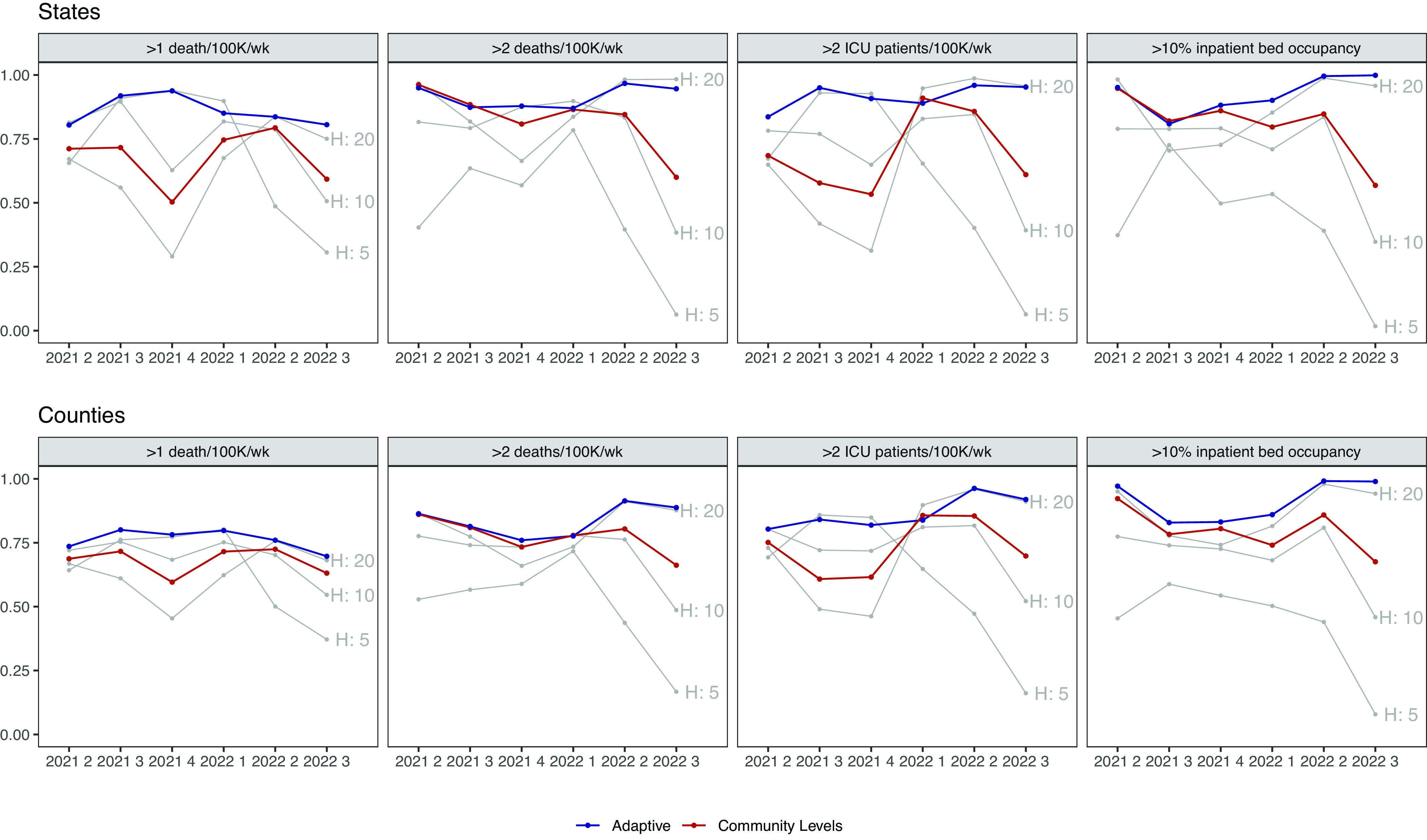
Fig. 4.

Weighted accuracy by metric. The top plot displays states, and the bottom plot displays counties. Columns indicate different outcomes. The x-axis indicates quarter, and the y-axis predictive accuracy with neutral weighting. Gray lines depict metrics based on new hospital admissions exceeding the labeled threshold. The red line indicates CDC Community Levels and the blue line the best-performing adaptive metric in the training period of those listed in Fig. 3. A version with HSA-level results can be found in SI Appendix, Fig. S10.
