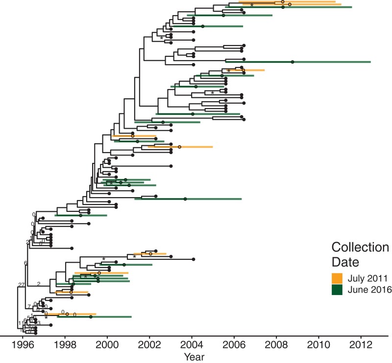
Fig. 3.
Phylogeny of date estimation analysis on P1. Nodes of the phylogeny are placed at their mean date. Colored circles indicate mean integration dates (i.e., estimated dates) and colored bars indicated their 95% HPD intervals for the integration dates. Black circles denote active sequences. Numbers on edges show the percentage of times that edge was sampled as the root after burn-in. Edges without numbers were not sampled as the root. Edges with at least 70% maximum likelihood bootstrap support are marked with an “asterisk.”

