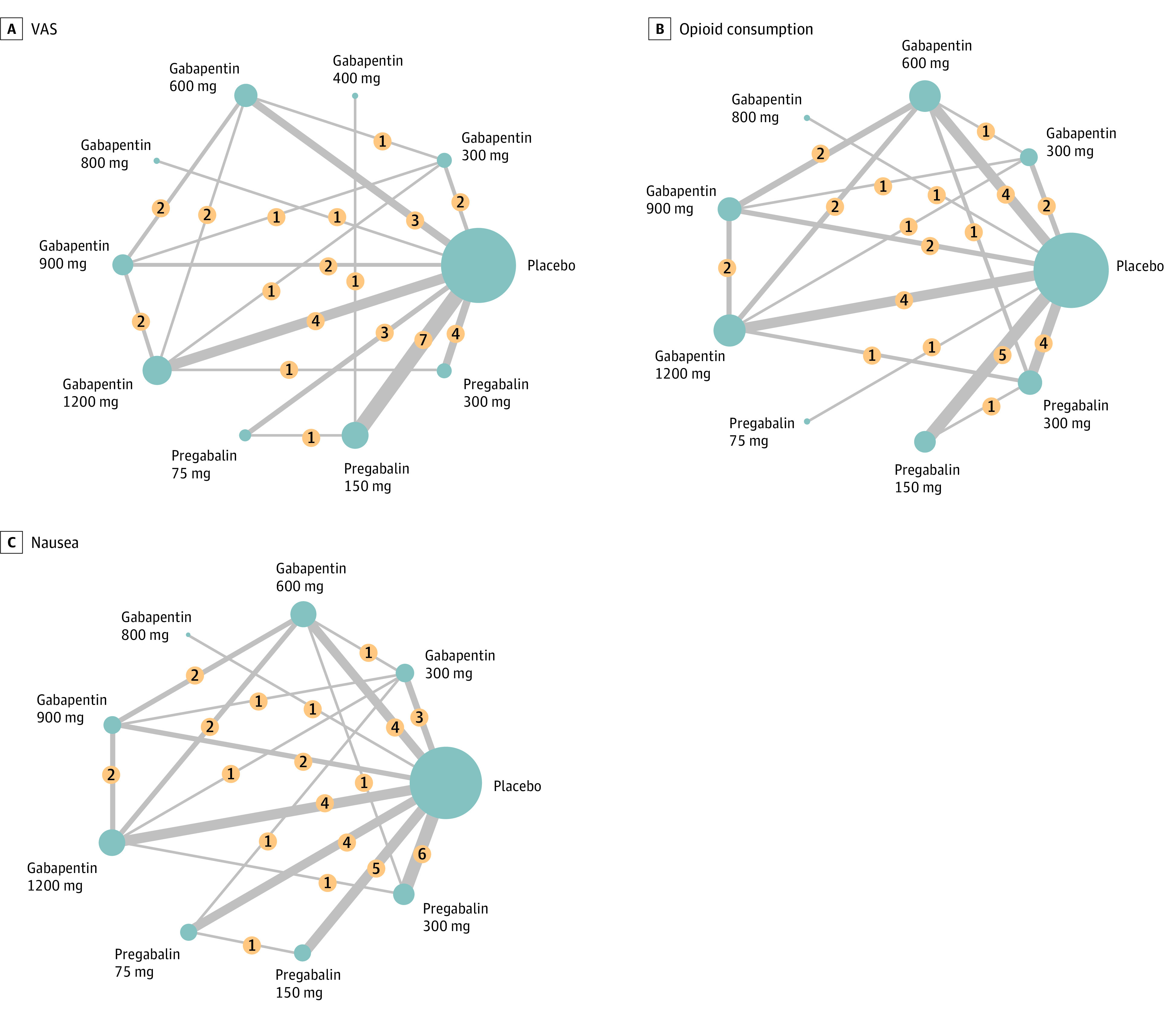
Figure 2. Network Structure Diagram Illustrating the Connections Between Interventions Based on Direct and Indirect Evidence Obtained From the Included Studies.

Each node in the diagram represents a specific intervention, whereas the lines connecting the nodes depict the available comparisons between interventions. The network structure provides a visual representation of the relationships and comparisons among the interventions. In this figure, we present the network structure for 3 specific outcome measures: postoperative Visual Analog Scale (VAS) score for pain intensity (A), postoperative opioid consumption (B), and postoperative nausea (C). Numbers in yellow circles denote the study numbers for the comparison of interventions. The thickness of the lines indicates the study numbers for the comparison of interventions. The sizes of the blue circles indicate the total patient number for each intervention.
