
Figure 2. Exploratory Analysis of Differentially Expressed Proteins in the Pooled Nemolizumab (Nemo) Group vs the Placebo Group.
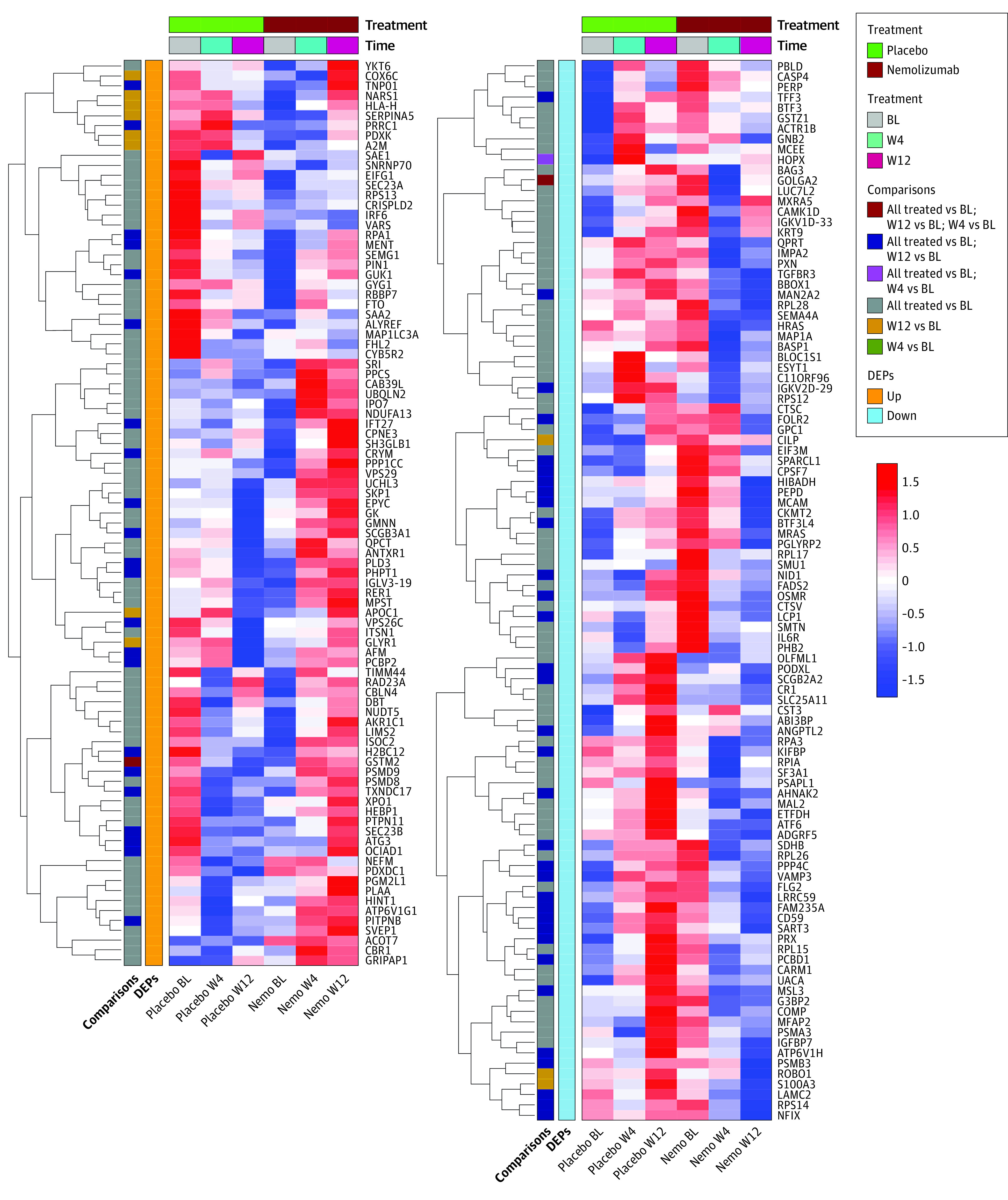
Heat map of mean abundances for the 193 upregulated and downregulated proteins for each time point (baseline [BL], week 4 [W4], and week 12 [W12]) and treatment combination. Protein abundance values shown in the heat map are mean-centered, scaled, and ordered by hierarchical clustering using Euclidian distances. Red colors represent higher-abundance values while blue colors represent lower-abundance values. All treated terms refer to all treatment time points (ie, week 4 and week 12) being jointly considered for the modeling, as opposed to separately considering week 4 and week 12 for the analysis. DEPs indicates differentially expressed proteins.