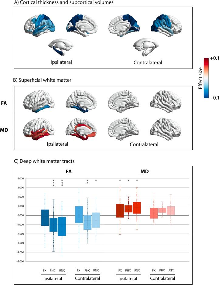
Fig. 1.
Whole brain comparison between TLE and controls. Panel A) visualizes significant group differences in cortical thickness and subcortical volume. Panel B) shows significant group differences of superficial white matter fractional anisotropy (FA) above, and mean diffusivity (MD) below. Data for each comparison are presented as effect size (Partial Eta Squared, η2). Blue colors (-0.1) represent the regions where TLE showed atrophy, or lower FA values, compared to controls; red colors (+0.1) represent the regions where TLE showed hypertrophy, or higher MD values, compared to controls. Only effect sizes associated with p-values that survived FDR correction (i.e., pFDR < 0.05) are presented in panels a) and b). Finally, panel C) shows box-and-whisker plots of deep white matter tracts, standardized relative to controls. The central horizontal line of the boxes marks the median of the sample, the upper and lower edges of the box (the hinges) mark the 25th and 75th percentiles (the central 50% of the values fall within the box). The open circles represent individual patients. The “x” in the middle of each box marks the mean values for each fasciculus. The black line on value 0 designates the mean volume of controls. The “*” on the box indicates the significant results of the MANCOVA analysis (*: pFDR < 0.05, **: pFDR < 0.01, ***: pFDR < 0.001). FX: fornix fasciculus, PHC: parahippocampal cingulum bundle, UNC: uncinate fasciculus. Brain maps in panel A) and B) were created by using the ENIGMA-Toolbox (Larivière et al., 2021). (For interpretation of the references to colour in this figure legend, the reader is referred to the web version of this article.)

