Fig. 3.
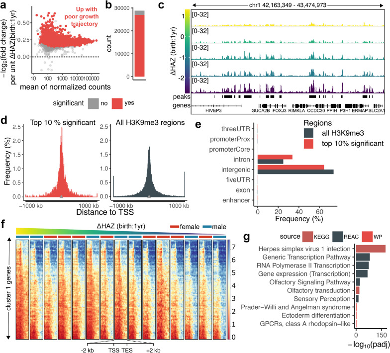
The most significant regions are nearby gene sites and highly enriched in viral infection pathways. a MA-plot shows changes of H3K9me3 levels with negative unit changes of ΔHAZ (birth:1yr) score. Each point is an H3K9me3 region, x-axis shows the mean normalized H3K9me3 coverage and y-axis shows −log2(fold change) of H3K9me3 coverage per unit increase of ΔHAZ (birth:1yr) score. Regions whose coverage increased in association with negative growth trajectory are above the x-axis. Regions with significant association (padj < 0.05) are highlighted in red. b Bar plot showing the number of H3K9me3 regions significantly associated vs. not significantly associated with ΔHAZ (birth:1yr) score in red and grey respectively. c Genome browser snapshot showing an example region, where normalized H3K9me3 coverage increased with poor growth trajectory indicated by low ΔHAZ (birth:1yr) score. d Histograms comparing the distances of the top 10% most significant (left) vs. all (right) H3K9me3 regions to TSSs. Shown are distances closer than ± 1 Mb from TSSs; more distal regions were accumulated into bins on both sides of the histogram. The distances from TSSs when not accounting for directionality are significantly higher within all H3K9me3 regions compared to the 10% significant regions (two sample t-test, H0: μtop10 = μall, H1: μtop10 < μall, p < 2.2e-16). e Bar plot showing relative distribution of the top 10% most significant vs. all H3K9me3 regions over genomic classes. The differences in the overlaps between the two classes are significant (Chi-square test, H0: the number of overlaps within the top 10% significant and all H3K9me3 regions are independent, p < 2.2e-16). f Heatmaps showing normalized H3K9me3 coverage over genes and ± 2 kb surrounding regions from cluster 1 identified in Additional file 1: Fig. S8. Heatmaps are organized based on child’s ΔHAZ (birth:1yr) score. g Results of gene enrichment analysis of cluster 1 genes shown in (f). Plotted are −log10 adjusted p-values (padj) of significant enrichments (padj < 0.05). Results come from three different sources: KEGG, Reactome (REACT), and WikiPathways (WP)

