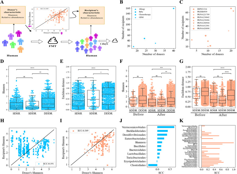
Fig. 1.
Relations between donor and recipient microbiomes. Note along the figure light blue represents analyses based on the human-to-GF cohorts, and light orange represents analyses based on the human-to-human cohorts. A Schematic figure of the raw relations between the donor’s samples properties and the recipient’s samples post-FMT treatment. The properties we followed during this analysis were the Shannon, the order’s relative abundances, and the species relative abundances and presence or absence. Each color represents a cohort. The raw relations were measured by calculating the SCC between the property in a donor sample and a recipient sample. B Scatter plot of the number of donors vs the number of recipients in each cohort over the human-to-GF cohorts, where GDM was marked with an asterisk (*), Allergy was represented by a triangle symbol, Chemotherapy was marked with an X, and Baby with a dot. C Scatter plot of the number of donors vs the number of recipients in each cohort over the human-to-human cohorts. D, E Similarity Shannon differences (D) and Euclidean distance between two recipients preprocessed ASVs (order-level) vectors in the human-to-GF cohorts (E). The rightmost bar, SDSR, represents the distances between samples of the same recipient (GF mouse) and the same donor (measures the time variability); the middle bar represents the distances between samples of different recipients (GF mice) that got FMT from the same donor, SDDR (measures the effect of the recipient background); and the leftmost bar represents the distances between samples of different recipients (GF mice) that received FMT from different donors, DDDR (measures the effect of the donor), with a significant hierarchy of distances. The lowest distances are within the same donor/recipient, followed by the same donor, followed by different donors. F, G Similarity Shannon differences (F) and Euclidean distance between two recipients’ preprocessed ASVs (order-level) vectors in the human-to-human cohorts (G) before and post-FMT. The rightmost bar represents the distances between samples of the same mouse and the same donor (SDSR, samples along time), the middle bar represents the distances between samples of different mice that got FMT from the same donor (SDDR), and the leftmost bar represents the distances between samples of different mice that received FMT from different donors (DDDR), with a clear and significant hierarchy of distances. The lowest distances are the same donor/recipient, followed by the same donor, followed by different donors ( , , ). When comparing the results before the transplant, there is no difference between the groups (before in plots F and G). H, I Scatter plots of donor’s Shannon vs recipient’s Shannon in human-to-GF cohorts (H) and human-to-human cohorts (I). The black line represents the line of a perfect match between the donor and recipient properties and each shape represents a different dataset according to the shapes in B and C. Similar results for all the orders are in Supplementary Material Figs. S4 and S5. J, K All donor-recipient orders and Shannon diversity SCCs in the human-to-GF cohorts (J) and the human-to-human cohorts (K)

