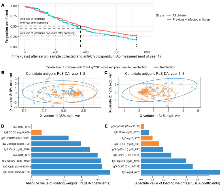
Figure 8. Cryptosporidium antigens associated with the development of a protective immune response.
(A) The survival curve illustrates the 2 subgroups of children and 2 follow-up periods after plasma was collected (end of year 1) that were analyzed for protection. The blue line follows only children who had a qPCR-verified Cryptosporidium infection (subclinical or symptomatic) during the first year of life, prior to sampling plasma. The red line follows all children in the array study and includes the immunologically naive children that remained uninfected at 1 year of age as well as those known to be previously infected. Dotted and dashed lines indicate the time points (year 2 and year 3) selected for analysis of the differences between uninfected and infected groups looking specifically at the protective candidate antigens identified in Table 1. (B and C) PLS-DA on the antibody profiles of the candidate antigens shown in Table 1 associated with either reinfection or protection. Each point represents the immune profile from 1-year-old children with prior qPCR-verified Cryptosporidium infections who were subsequently uninfected (blue circles) or reinfected (orange triangles) during the 1-year follow-up period (B) or 2-year follow-up period (C) after plasma samples were collected. (D and E) Predictor loadings derived from the PLS-DA analysis in (B and C) are shown, respectively. Antibody targets are shown on the Y-axis, and the X-axis shows the absolute value of the loading weights (or PLS-DA regression coefficients); the absolute value was used to focus attention on the importance of each antigen in maximizing the covariance between antibodies and Cryptosporidium infection outcomes. Orange bars indicate antibodies more abundant in the children who subsequently had a new Cryptosporidium infection and blue bars indicate the antibodies more abundant in the uninfected children.

