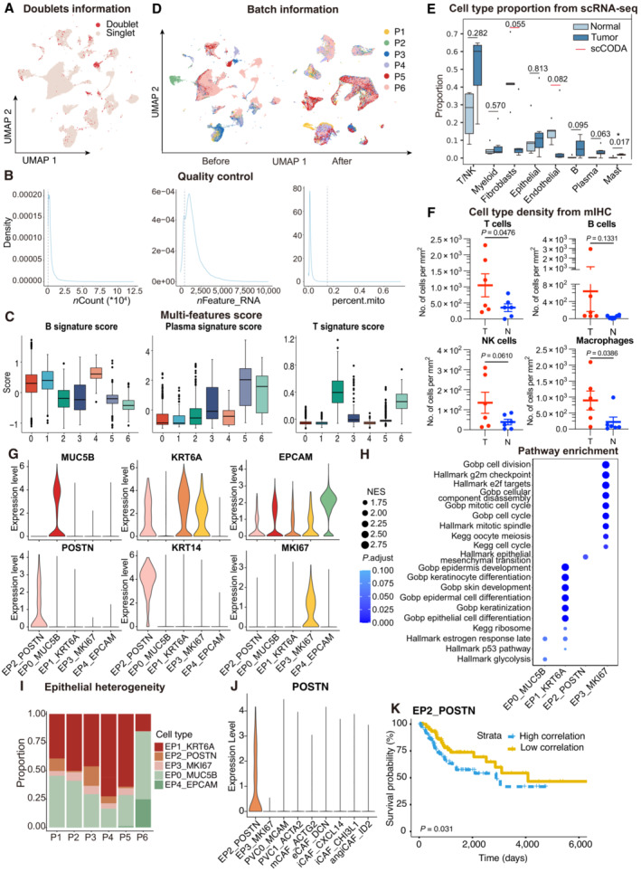
Figure EV1. ScRNA‐seq profiling of the ecosystem in CC samples.

- UMAP plot showing the distribution of singlets (pink) and doublets (red) in CESC as evaluated using by R packages “DoubletFinder”.
- Density plots showing the distribution of UMIs (left panel), genes (middle panel), and mitochondrial percents (right panel) of all single cells. The light gray dotted line denotes the cut‐offs of quality control.
- Boxplots showing the T, Plasma and B cell three signature scores of B cell subtypes.
- UMAP plot showing the information of Batch from patients. Before (left panel) and after (right panel) batch effect removal.
- Boxplots showing the cell‐type proportions of six patients for matched tumor and normal samples. P < 0.05 was considered statistical significance; The scCODA model and the ALDEx2 model were used to examine the differences in cell‐type composition. Red bars indicate credible and significant results of scCODA. Stars indicate the significance calculated by ALDEx2 model (* P < 0.05).
- Scatter plots showing the quantification of T cells (CD3+), B cells (CD20+), macrophages (CD68+) and NK cells (CD56+) in tumor area (T) and adjacent normal tissue (N, n = 6). Represented Mean ± SEM. P‐value was measured by paired Student's t‐test.
- Violin plot showing the expression of marker genes in epithelial subclusters.
- Dot plot showing the selected signaling pathways (rows) with significant enrichment of GO, KEGG and Hallmark terms for four epithelial cell clusters.
- Stacked bar plot showing the epithelial cell clusters distribution among patients.
- Violin plot showing the expression of POSTN in EP2 and fibroblasts.
- OS rates for the high‐correlation and low‐correlation groups in TCGA, stratified using the EP2_POSTN signatures removed overlapped genes with fibroblasts. P‐values are calculated using the log‐rank test (N = 255).
Data information: Boxplots show the median and upper/lower quartiles (Related to Fig 1).
