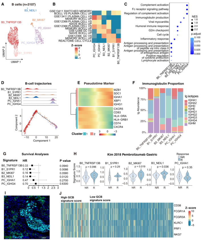
Figure 3. GC response identified in cervical cancer.

- UMAP plot showing the subtypes of 3,107 B cells. Cluster annotations are denoted and coloured corresponding to cell types in the figure.
- Heatmap showing the characterization of different B‐cell populations with B‐cell‐related pathways.
- Dot plot showing the selected signaling pathways (rows) with significant enrichment of GO terms for B‐cell and plasma clusters.
- 2D graph of B cells trajectories. The cell density distribution, by the pseudo‐time, is shown at the top of the figure and colored corresponding to cell types.
- Heatmap showing immune‐associated genes in the differentiation process.
- Stacked bar plot showing immunoglobulin (Ig) abundance of each B cell sub‐cluster.
- A forest plot showing the association of different B‐cell signatures with survival across the TCGA SCC cohort. Squares and lines indicate hazard ratios (HRs) and 95% confidence intervals (CIs), respectively. HRs were calculated using univariable Cox regression; P‐values were calculated using log‐rank test.
- Violin plots showing the association of different B‐cell signatures with the response (R, N = 15) and no response (NR, N = 42) to Pembrolizumab in the Kim cohort. P‐values calculated using the student's t‐test.
- Representative mIHC of plasma cells in CC tumor area. plasma cells: CD38+Pan‐CK−, scale bar = 100 μm.
- Expression of the genes that comprise the plasma cell and ADCC signatures in TCGA cohort.
Data information: Violin plots show the median and upper/lower quartiles.
