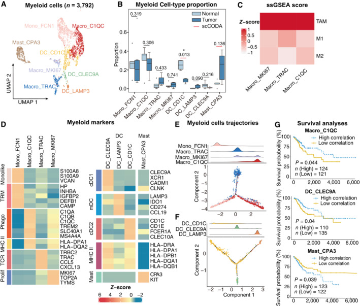
Figure 5. Phenotype diversity of myeloid cells in CC.

-
AUMAP plot showing the subtypes of 3,792 Myeloid cells. Cluster annotations are denoted and colored corresponding to cell types in the figure.
-
BBoxplots showing the cell‐type proportions of myeloid cells for matched tumor and normal samples (n = 5). The scCODA model and the ALDEx2 model were used to examine the differences in myeloid cells' composition. Red bars indicate credible and significant results of scCODA. Stars indicate the significance calculated by ALDEx2 model (*P < 0.05).
-
CHeatmap showing the characterization of different macrophage cell populations with M1, M2 and TAM scores.
-
DHeatmap showing the expression of marker genes in each subtype of myeloid cells; TRM, tissue‐resident macrophage; Phago, phagocytosis.
-
E, F2D graph of myeloid cells trajectories, from monocyte/macrophage cell (E) and Dendritic cell (F) subsets. The cell density distribution, by the pseudo‐time, is shown at the top of the figure and colored corresponding to cell types, respectively.
-
GComparison of Overall survival (OS) rates for the high‐correlation and low‐correlation groups, stratified using the Macro_C1QC (upper panel), and Mast_CPA3 (lower panel) signatures in TCGA (N = 255). P‐values are calculated using the log‐rank test.
Data information: Boxplots show the median and upper/lower quartiles.
