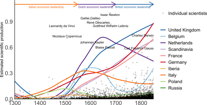
Figure 3.
Scientific Production per capita (1500–1850). Black points represent individual scientists' estimated production, with the 10 highest scoring individuals labelled. The coloured curves represent the log-transformed aggregated scientific production per country, computed as the sum of the individual scientists estimated production over a window of 50 years, divided by their population at the time and smoothed by a local regression algorithm (loess). The economic leadership of Italy (orange), the Netherlands (purple) and the United Kingdom (blue) in terms of per capita GDP (>1500 dollars per capita and positive growth) coincides with their leadership in per capita scientific production.

