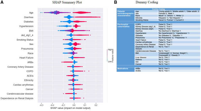
Figure 4.
Summary plots for SHAP values. (A) indicates 20 features with the highest mean absolute SHAP values. Each point refers to each patient for the respective feature (row). A position of the point along the x-axis (i.e., SHAP value) represents the features’ influence on the model output for the explicit patient. A higher SHAP value has a higher impact on “mortality” relative to a lower SHAP value (54, 55). The features are arranged in order of importance on the y-axis, i.e., the more important features are placed at the top, given by their absolute Shapley values. Some outliers characterized by early stages of kidney disease, COPD, dependence on renal dialysis, etc., are also visible (green arrows). Positive SHAP values indicate an impact in predicting “mortality”, and negative SHAP values indicate an impact in predicting “survival” outcomes. (B) indicates the dummy coding, which could be used as a reference to compare the color coding [lower no represents a “cool” color, and higher no represents a “hot” color per category, as seen in (A)] of the SHAP beeswarm plot. (A) depicts “mortality” includes both linear-dominated relationships (in a box), such as diarrhea, sex, heart failure, etc., and non-linear-dominated relations, such as age, BMI, race, etc.

