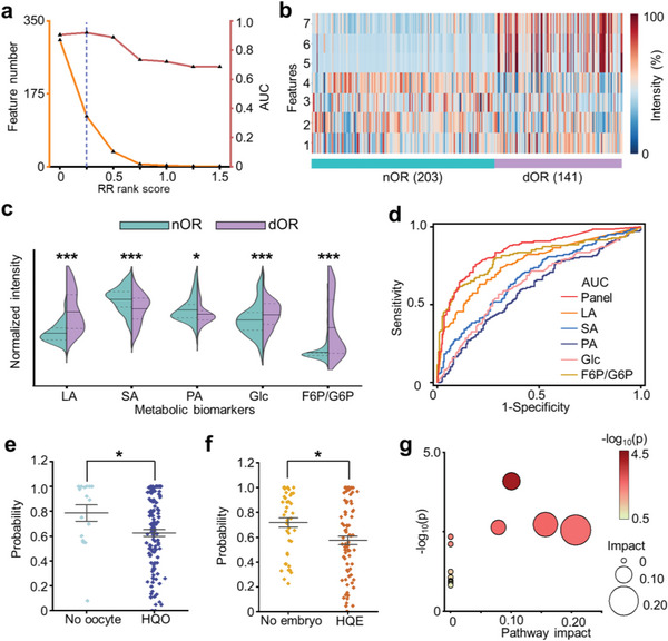
Figure 4.

Biomarker panel construction and related pathway analysis. a) Feature number (orange line) and AUC of RR (red line) calculated at various thresholds of RR rank score in the discovery cohort. Blue dotted lines indicated the optimized AUC of 0.919 at the threshold of 0.25. b) Intensity heatmap of 7 m/z features showing distinct expression levels between dOR and nOR. The color bars represented intensities corrected by logarithms. c) The violin plot displaying the intensity levels of identified biomarkers for dOR and nOR. A two‐tailed t‐test was used to determine the p values (* represented p < 0.05, ** represented p < 0.005, *** represented p < 0.001). The biomarker intensities were normalized. d) The ROC curves for the biomarker panel with an AUC of 0.849, superior to the single biomarker with an AUC of 0.571–0.803 (p < 0.05 by Delong test). e) The comparison of probability for the HQO group and no oocyte group in predicting oocyte quality using constructed biomarker panel (* represented p < 0.05). A two‐tailed t‐test was conducted to calculate the p values. f) The comparison of probability for the HQE group and no embryo group in predicting embryo quality using constructed biomarker panel (* represented p < 0.05). A two‐tailed t‐test was conducted to calculate the p values. g) The potential pathways associated with dOR and nOR. The size and color of the circles represented the p‐value and pathway impact, respectively.
