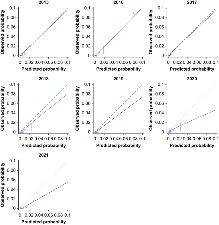
Figure 3.
Annualised calibration plots for SORT predictions of 30-day mortality according to financial year end (July 1 to June 30). Dashed line represents perfect calibration, blue line is non-parametric smoothed best-fit curve, green bars are 95% confidence intervals. SORT, Surgical Outcome Risk Tool. (For interpretation of the references to colour in this figure legend, the reader is referred to the Web version of this article.)

