Figure 4.
HPO analysis of the DHX9 cohort
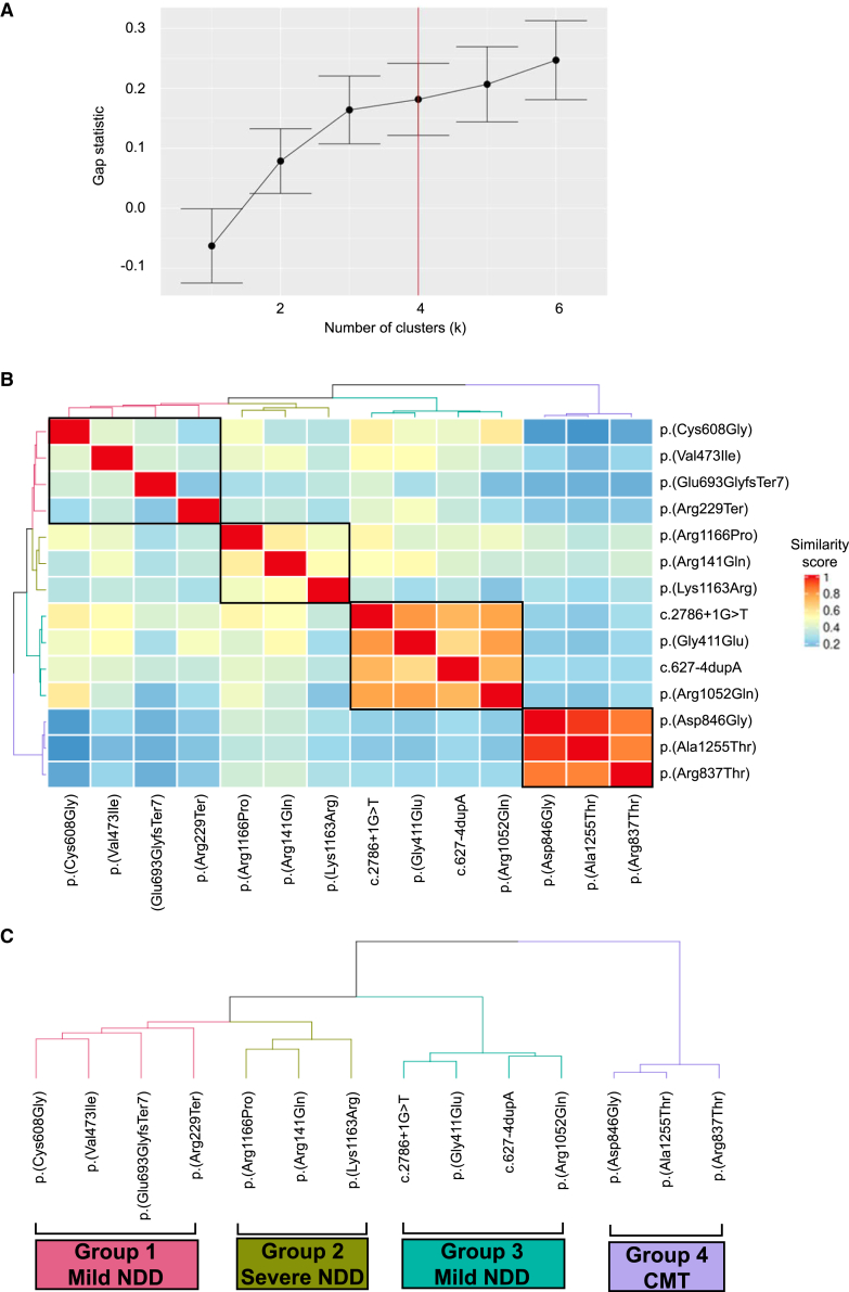
(A) Gap statistic curve for the DHX9 cohort. The gap statistic is displayed on the y axis, and the number of clusters tested is on the x axis. The point on the curve where the slope changes from a trend of higher to lower (i.e., additional clusters do not add as much to the gap statistic) was chosen as the optimal number of clusters (k = 4).
(B) HAC and visualization of quantitative phenotypic similarity allow refinement of genotype-phenotype correlations in the DHX9 cohort. The dendrogram shown at the top and to the left of the heatmap is based on HAC analysis of the dissimilarity matrix produced from Resnik semantic similarity scores and with k = 4. Unique clusters are represented by different colors, and variants found in individual probands are labeled on top of and to the right of the heatmap. Within the heatmap, dark red indicates a higher similarity, whereas dark blue indicates a lower similarity. A key is provided on the right.
(C) Magnified dendrogram showing unique clusters and group characteristics.

