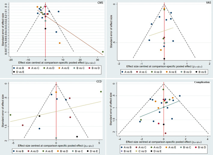
FIGURE 4.

Comparison‐adjusted funnel plot. The red full line represents the null hypothesis that the study‐specific effect sizes do not differ from the respective comparison‐specific pooled effect estimates. The two black dashed lines represent a 95% CI for the difference between study specific effect sizes and comparison‐specific summary estimates. yixy is the noted effect size in study i that compares x with y. lxy is the comparison‐specific summary estimate for x versus y. A, HP; B, TR; C, TG; D, EB; E, SA.
