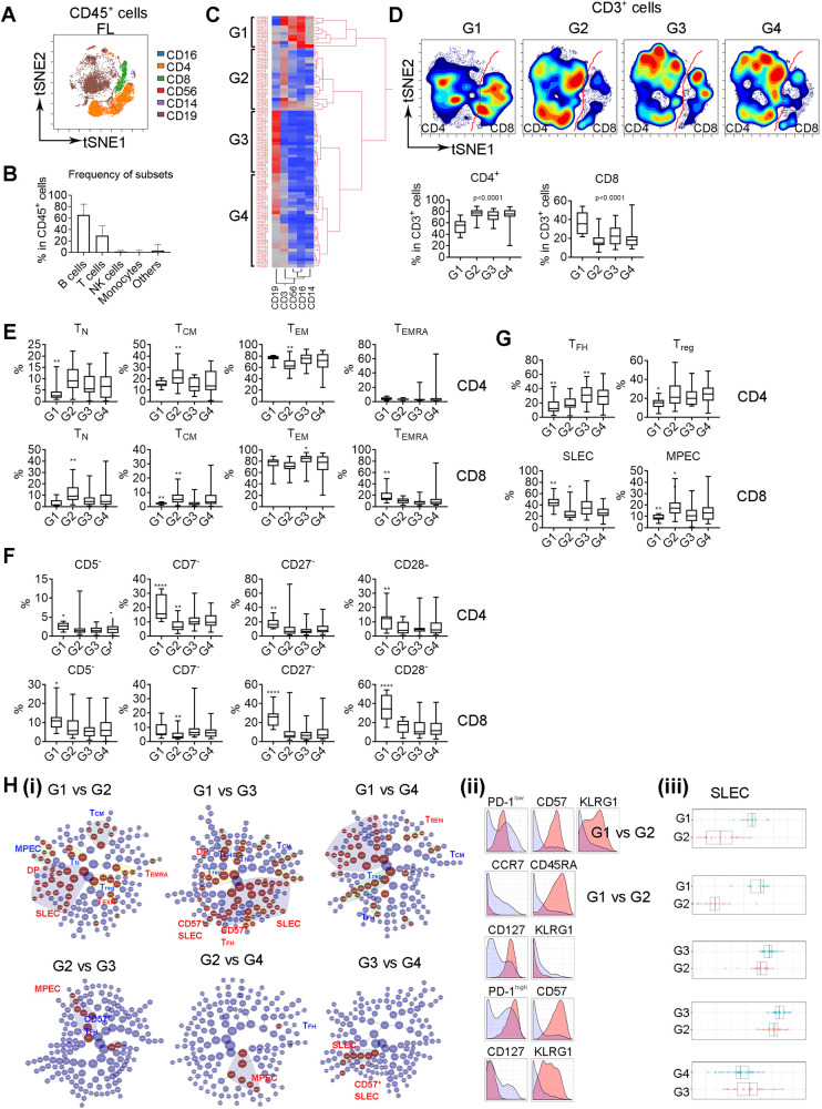
Fig. 1. T-cell phenotype varies in patients with distinct tumor microenvironments in FL.
A The tSNE plot showing expression and distribution of CD16+, CD4+, CD8+, CD56+, CD14+, and CD19+ in CD45+ cells from a representative FL biopsy specimen, n = 82. B Graph showing percentage of B, T, NK, monocytes, and others in CD45+ cells in FL biopsy specimens (n = 82). C Heatmap showing four patient groups clustered by the content of CD19+, CD3+, CD14+, CD56+, and CD16+ cells using hierarchical clustering analysis. D The tSNE plots of CD3+ subsets from four patient groups and the t-SNE analysis was performed on a concatenated file of each patient group. The red line was drawn to separate CD4+ and CD8+ T cells. Graphs below showing percentage of CD4+ and CD8+ cells in each group. The p value indicates a difference between G1 and G2, G1 and G3 or G1 and G4 in both CD4+ and CD8+ cells. E–G Graphs showing percentage of TN, TCM, TEM, and TEMRA (E) as well as CD5−, CD7−, CD27−, CD28− (F) in both CD4+ and CD8+ cells in each group. graphs in Figure G showing percentage of Treg and TFH in CD4+ and SLEC and MPEC in CD8+ cells in each group. The p value indicates a difference between group with * and the other groups. *<0.05; **<0.01; ***<0.001; ****<0.0001. H CITRUS plot showing clustering results from FL patients divided by twq patient groups. Circles in red represent clusters that differed between groups. Each class of clusters was annotated based on the phenotype. Histogram plots showing expression of selected markers by cells from clusters overlaid on background staining (i). Expression level of each selected marker was expressed by cluster (red) over background (light blue) (ii). Graph showing quantitative results of abundance from selected clusters (iii).

