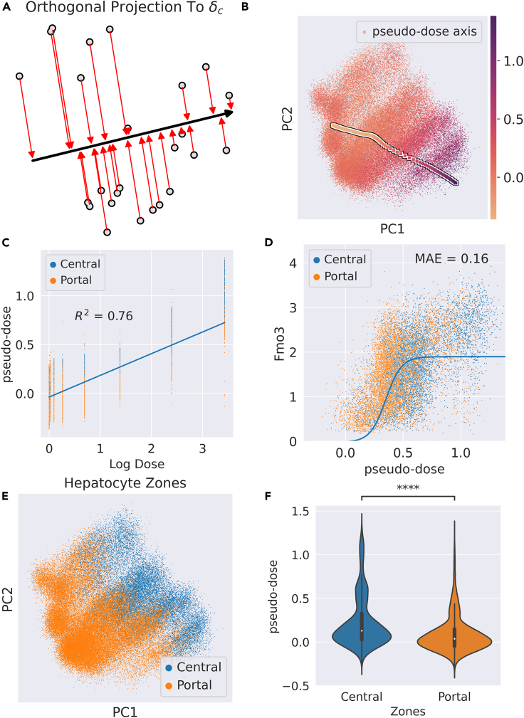
Figure 5.
Pseudo-dose ordering of hepatocytes across TCDD dose-response
(A) Schematic diagram of assigning pseudo-dose values to hepatocytes by orthogonally projecting each cell in latent space to the span of the .
(B) PCA projection of hepatocytes colored by assigned pseudo-dose values. The arrow markers represent the pseudo-dose axis calculated by the .
(C) Regression plot of pseudo-dose versus log transformed real dose.
(D) Plot of pseudo-dose versus Fmo3 expression. Associated logistic fit (solid blue line) and associated mean absolute error annotated as “MAE.”
(E) PCA projection of hepatocytes colored by assigned hepatocyte zone in the liver lobule.
(F) Violin plot of the distribution of pseudo-dose values in the central and portal zones of the liver lobule. Central hepatocytes exhibit a higher pseudo-dose on average than portal hepatocytes Significance was determined by the Mann-Whitney single-sided U test. ∗∗∗∗p < 0.0001.

