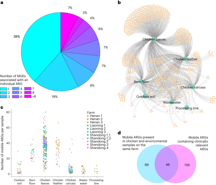
Fig. 1. Analysis of potentially mobile ARGs.
a, Pie chart showing the proportion of ARGs (out of the 195 found) associated with one or multiple MGEs. b, Undirected network graph showing potentially mobile ARGs (small orange circles) associated with different sample sources (large green circles). The edges in the graph link the potentially mobile ARGs to the sources in which they were found. c, Number of potentially mobile ARGs per sample per source. Each circle represents a single sample, with circles coloured by farm. d, Venn diagram showing that 145 (out of 661) potentially mobile ARGs were found to be present in both chicken and environmental samples from the same farm, and 182 potentially mobile ARGs contained clinically relevant ARGs. An overlap of 46 clinically relevant30 potentially mobile ARGs was found in chicken and environmental sources obtained from the same farm. Note that in this analysis, samples from the same source collected at t1 (week 3) and t2 (week 6) were aggregated together, leading to a total of seven sources considered for each farm.

