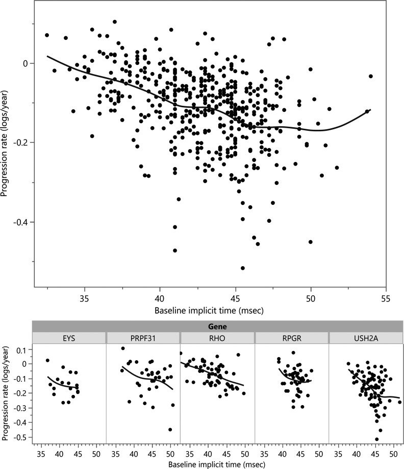
Figure 3. Individual cone flicker ERG amplitude decay rates were calculated for each study participant (y axis), and plotted by baseline ERG cone flicker implicit time (x axis), for all participants (top).
A spline fit shows the trend toward worse progression rates with increasing baseline implicit time. Participants from the largest gene subgroups are shown below. (One outlier point beyond the y axis is not shown.)

