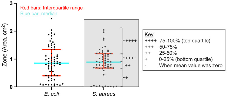
Figure 3. Defining the quartile ranges for semiquantitative analysis.
To perform the unbiased semiquantitative analysis, we first defined quartile ranges for all data grouped by bacterial strain. Scatter dot plot with all data from E. coli or S. aureus. To remove skewness in the data, zero values were removed from this analysis. Red bar represents the interquartile range comprising the center 50% of data. Blue bar represents the median, which separates the top 50% from the bottom 50% of data. The key shows the number of plus signs (“+”) assigned to each quartile. This is given as an example in the gray-filled box for S. aureus. E. coli: Escherichia coli, S. aureus: Staphylococcus aureus.

