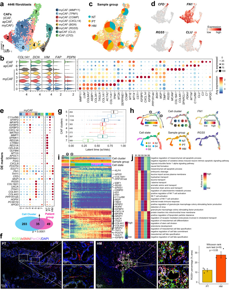
Fig. 4. Transcriptional profiling of fibroblasts in the tumor microenvironment of primary and metastatic PDAC tissues.
a UMAP showing the subtypes of cancer-associated fibroblasts (CAFs), including iCAF, apCAF and myCAF, colored by subclusters. b Violin plots (left) displaying the representative expression pattern across different subtypes of fibroblasts. Dot plot (right) showing the expression of the top five subtype-specific gene markers in each subtype. c Distribution of CAFs in different sample groups on the UMAP. Pie chart showing the proportion of three sample groups in each CAF subcluster. d Feature plots showing the expression of selected cluster-specific genes. Cells with the highest expression level are colored red. e Venn diagram (bottom) showing the overlap of DEGs between subclusters and sample groups of CAFs. The p value was calculated using the χ² test. Dot plot (top) showing the expression of these 35 DEGs across all stroma cell subclusters and sample groups. f Immunofluorescent staining showing co-localization of RGS5 (green), a-SMA (red), PanCK (purple), and DAPI (blue) in PT and HM samples. Scale bars, 50 μm (left) and 20 μm (right). The bar plots show the quantification results, n = 3 patients with paired PT and HM samples. The error bar indicates standard error of the mean (s.e.m.). The p value is calculated with one-sided Wilcoxon rank-sum test. g Boxplot showing the latent time of CAF subtypes by RNA velocity.The number of cells in each category is indicated in the left of boxplot (0: n = 1108; 1: n = 1016; 2: n = 383; 3: n = 272; 4: n = 446; 5: n = 264; 6: n = 397; 7: n = 560). The boxes showing the median (horizontal line), second to third quartiles (box), and Tukey-style whiskers (beyond the box). h Semisupervised pseudotime trajectory of CAF subtypes by Monocle2. Trajectory is colored by pseudotime (top left), cell states (bottom left), cell clusters (top middle), sample groups (bottom middle), and expression dynamics of two marker genes FN1 and RGS5 (right). i Heatmap showing the scaled expression of differentially expressed genes across pseudotime from h. Genes (listed to the right of the heatmap) are assigned to specific cell states based on their expression levels. Bar plots above the heatmap are scaled diagrams of different cell states, sample groups and cell clusters during pseudotime differentiation trajectory. j Heatmap showing the functional pathways enriched in five cell states (S1–S5) of CAFs by GSVA analysis.

