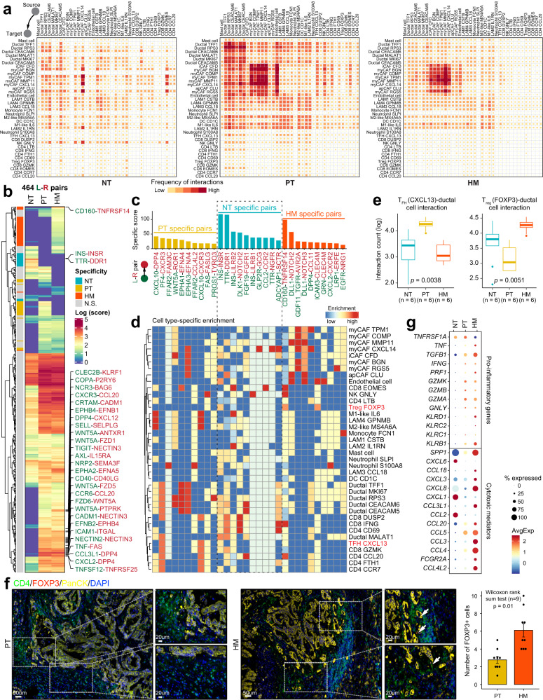
Fig. 7. Dynamics of cell–cell interaction networks in the tumor microenvironment of primary and metastatic PDAC tissues.
a Heatmap illustrating the cell–cell interaction patterns in NT, PT, and HM samples. b Heatmap showing the interaction scores for 464 ligand–receptor pairs in NT, PT, and HM groups, respectively. Group specificity is displayed on the left of the heatmap. c Bar plot showing group-specific ligand–receptor pairs in three sample groups. d Heatmap showing the enrichment of sample-specific ligand–receptor pairs in cell subtypes. e Boxplot indicating cell–cell interaction counts between TFH (CXCL13) and ductal cells, as well as between Treg (FOXP3) and ductal cells. The number of ligand–receptor pairs (n = 6) in each category is indicated below the boxplot. The boxes showing the median (horizontal line), second to third quartiles (box), and Tukey-style whiskers (beyond the box). The p value is calculated with one-sided Wilcoxon rank-sum test. f Immunofluorescent staining showing co-localization of CD4 (green), FOXP3 (red), PanCK (yellow), and DAPI (blue) in PT and HM samples. Scale bars of each group, 50 μm (left) and 20 μm (right). The bar plots show the quantification results, n = 3 (9 view fields in total). The error bar indicates standard error of the mean (s.e.m.). The p value is calculated with one-sided Wilcoxon rank-sum test. g Dot plot illustrating the expression and frequency of representative pro-inflammatory and cytotoxic-mediator genes in NT, PT, and HM samples.

