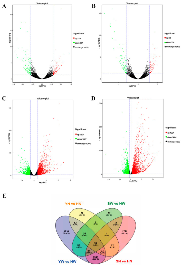
Figure 2.
Analyses of DEGs in four comparisons. (A–D) YW vs. HW, YN vs. HN, SW vs. HW, and SN vs. HN groups, respectively. Red and green points indicate the genes with significantly increased or decreased expression, respectively (FDR < 0.05). The x-axis shows the log2-fold change in expression, and the y-axis shows the log10-fold likelihood of a gene being differentially expressed. (E) Venn diagram showing the overlap of the DEGs in four comparisons.

