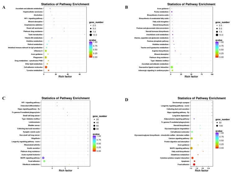
Figure 5.
Scatterplot of the top 20 pathways in KEGG enrichment. (A) YW vs. HW groups. (B) YN vs. HN groups. (C) SW vs. HW groups. (D) SN vs. HN groups. The x-axis represents the rich factor, which is the ratio of the DEGs annotated with the pathway term to the total number of genes annotated with the pathway term. The greater the rich factor is, the greater the degree of enrichment. The y-axis shows each KEGG pathway name. Each round point represents a specific KEGG pathway. The circle size indicates the number of DEGs associated with each significantly enriched pathway. The circle color indicates the significance level (q-value). A q-value < 0.05 was considered to indicate significant enrichment. Light purple indicates the least significant, and orange represents the most significant.

