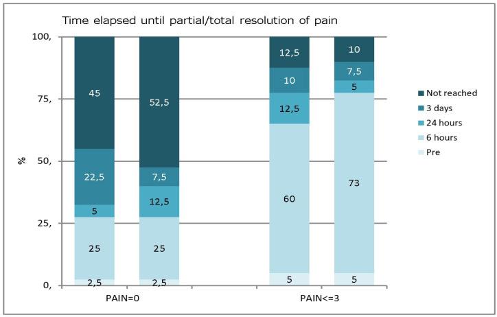
Figure 2.
Percentage of patients reaching zero and low pain levels at different follow-up times in the two groups. The bar graph on the left corresponds to patients who reached a pain level of 0, and the bar graph on the right corresponds to patients who reached a low level of pain. The bars are for PEC (left) and POT (right). The numbers represent the percentages. PEC: Pulpectomy; POT: Pulpotomy.

