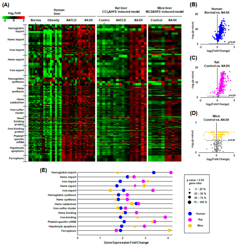
Figure 7.
GEO data analysis of human, rat, and mouse NASH. (A) Heatmap plot of the factors classified by GO terms related to heme and iron metabolism, showing upward mRNA expression of most factors in NAFLD compared to healthy controls in humans, rats, and mice. Green indicates an above-average increase, red indicates a below-average decrease, and black indicates no difference from the average. The intensity of a color is proportional to the base 2 logarithm. (B–D) Volcano plots showing that most factors related to heme and iron metabolism are statistically significant. Gray dots are not significant. (E) Gene ontology enrichment plot comparing NASH to normal controls.

