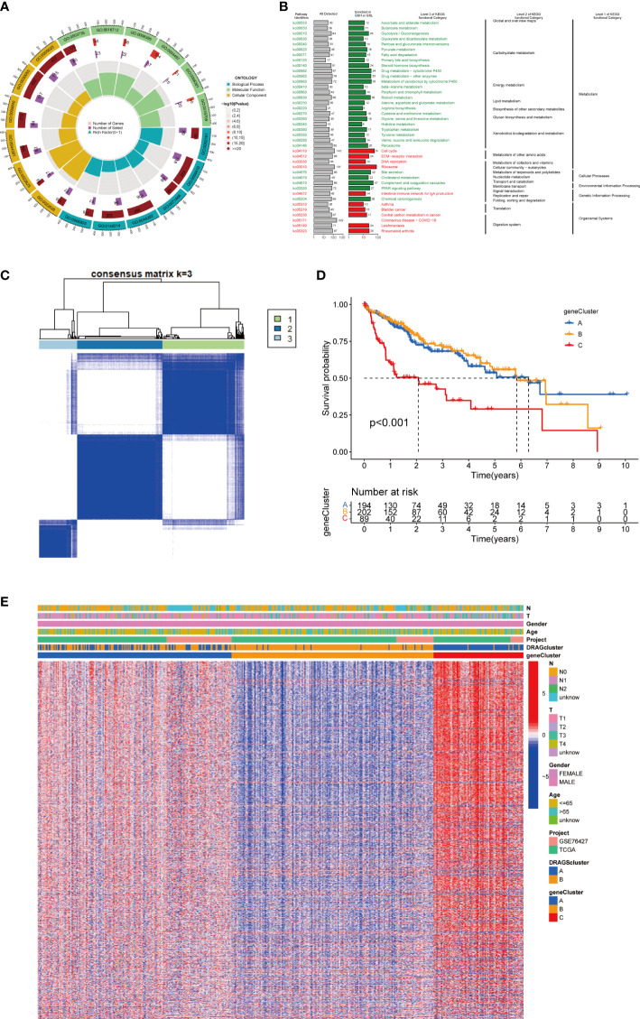
Figure 4.
Genecluster analysis. (A) GO enrichment analysis of DEGs between two DRAGs subtypes. The red part of the graph represents the number of enriched genes, the redder the color means the more significant gene enrichment; the purple part represents the number of enriched differential genes. The bar graph represents the proportion of genes. (B) KEGG enrichment analysis of DEGs between two DRAGs subtypes. (C) Consensus matrix plot defining the three cluster-related regions. (D) Kaplan-Meier curves for the three gene subtypes. (E) Relationship between the three gene subtypes and clinicopathological features.

