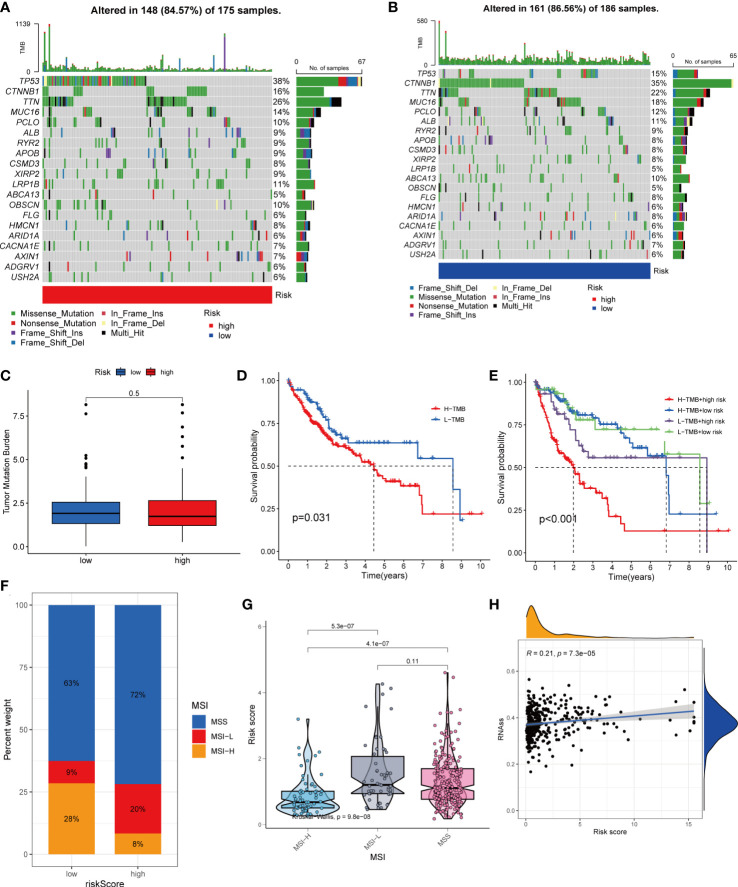
Figure 8.
Comprehensive analysis of the risk score in HCC. (A, B) Waterfall plots of somatic mutation frequencies and mutation types between different risk groups. Each column represents an individual patient. The bar above each column shows the TMB, and the number on the right side indicates the mutation frequency of each gene. The bar on the right shows the proportion of each mutation type. (C) Differences in TMB across risk groups. (D) Survival differences between high and low TMB groups in HCC. (E) Survival differences between patients with combined TMB and risk score assessment in HCC. (F, G) Relationship between Risk score and MSI. (H) Relationship between Risk score and CSCs.

