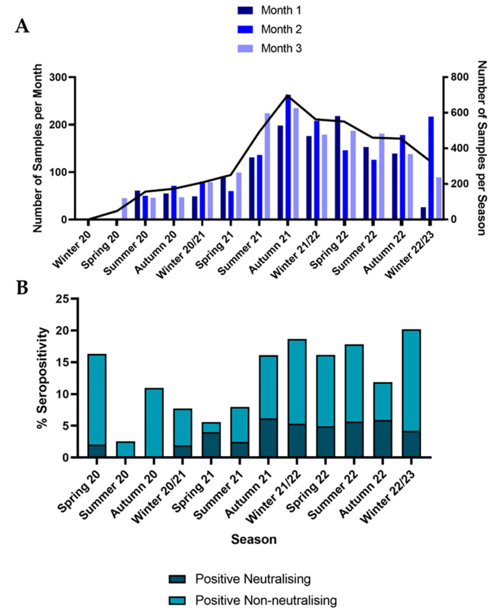
Figure 1.
(A) Bar plot showing the number of samples included in the dataset per month on the left y axis. On the right y axis, the total number of samples per season in the dataset is shown as a black line. (B) Stacked bar plot showing the total percentage seropositivity across different seasons. The darker bars depict positive neutralising samples, and the paler stacked bars show positive non-neutralising samples.

