Figure 3.
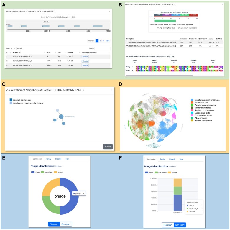
The visualization of the results. (A) The visualization of the homology search on the input contigs. The position of the translated proteins with high alignments score will be shown, and the detailed alignment results (B) can be accessed by clicking the visualize button. (C) We will show the one-step neighbors on the sequence-similarity graph to reveal the relationships between the input contigs and the phages/bacteria in the database. The complete sequence-similarity graph is provided in the “Network” panel in Fig. 2. They are in the standard format for most network-based visualization tools. One example using Gephi to visualize the graph is shown (D). (E) The pie graph of the prediction result. (F) The stacked bar graph is provided as an alternative option.

