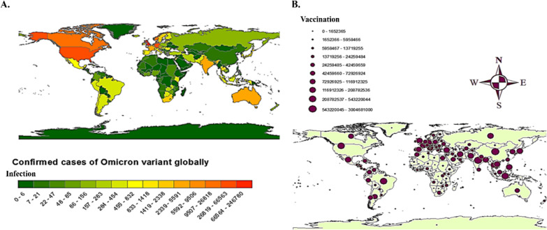
Fig. 3.
A Depicting the confirmed cases of Omicron variant globally. The rectangular bar chart indicates minimum (extreme left bar with dark green shade) and maximum (extreme right bar with dark red shade) infected cases with the range given against each of the bars. B Showing the number of vaccinated people worldwide with a range indicating the number of vaccinations from minimal (smallest circle) to maximum (largest circle). The maps have been created by using ARCGIS (https://www.esri.com/en-us/arcgis/products/arcgis-for-office/download)

