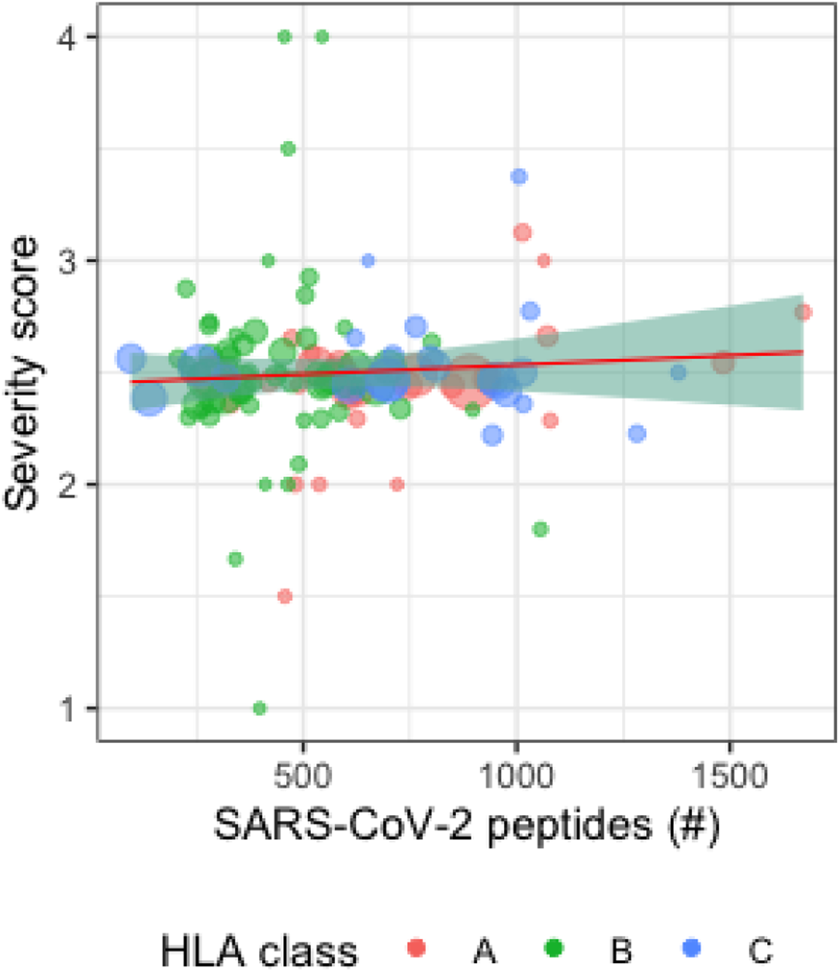
Figure 2:

Scatter plot of HLA alleles with the number of predicted peptides vs. average severity score in the AncestryDNA dataset. Each data point represents a distinct HLA allele, with larger points representing larger numbers of individuals in the AncestryDNA dataset imputed to have the allele and the red, green, and blue colors representing HLA-A, HLA-B, and HLA-C respectively.
