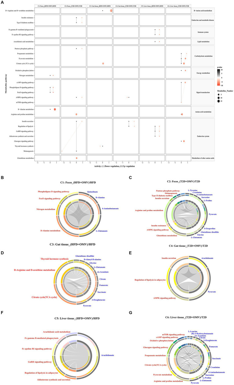
Figure 6.
Metabolic pathway enrichment. (A) Activities of metabolic pathways in feces, gut tissue, and liver tissue for comparisons 1–6. Black dots represent metabolic activities in feces, gut tissue and liver tissue from the HFD group and the T2D group that were adjusted to 0. Red dots represent metabolic activities in feces, gut tissue, and liver tissue from the HFD + OMV group and the T2D + OMV group. The metabolic activities were visualized using a log2 scale. The dot size indicates the number of metabolites involved in the pathway, and the intensity of the red dot color indicates the significance of p-value. (B–G) Circos plots display the connectivity of significant metabolites and their pathways in feces for comparison 1 (B) and comparison 2 (C). The connectivity between significant metabolites and pathways in the gut tissue for comparison 3 is shown in (D) and for comparison 4 is shown in (E). Similarly, comparisons 5 (F) and comparison 6 (G) show the connectivity between significant metabolites and pathways in the liver tissue. In (B–G), the red text signifies the shortlisted metabolic pathways and the blue text represents the significant metabolites.

