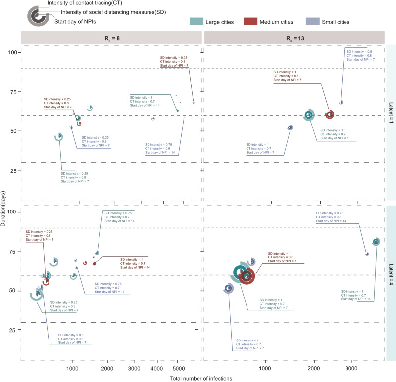
Fig. 4. Effectiveness of combined interventions in cities with different population sizes and transmission scenarios.
The x axis represents the mean value of the total number of infections in the corresponding size of cities, while the y axis represents the mean value of the durations in the corresponding size of cities. The rings of each combination represent the start day of NPI implementation for each outbreak (innermost ring), social distancing intensity (middle ring), and contact tracing intensity (outer ring), respectively. The green, red, and blue colors correspond to large cities (LC), medium cities (MC), and small cities (SC). We considered each combination to be effective when it is valid for more than three cities in parallel. We assumed a 50% probability that an individual wears a mask when in contact with an infected person during outbreaks, considering feasibility and generalizability to the other countries/areas. The simulation results of other scenarios are available in supplementary (See Supplementary Figs. 16–38).

