Figure 4.
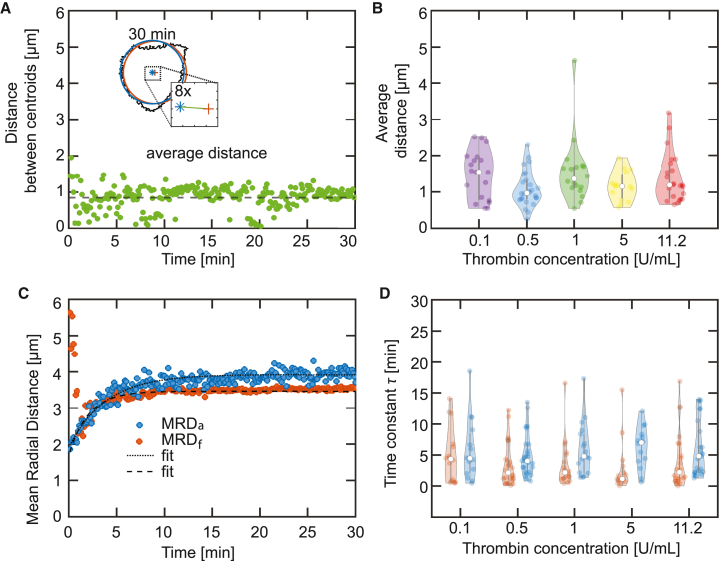
The centroids of the force hotspots and the actin boundary collapse with time. (A) The inset shows an overlay of the actin boundary (black), the circle (blue), and the circle (orange) for the min image. The distance between the centroids of the two circles is shown in the zoom-in and is represented by the green line. The distance between the centroids is calculated for each time point and is plotted in a time-resolved manner. The average distance is represented as the dashed black line. This analysis is repeated for every platelet used in the experiments with differing thrombin concentrations. The example platelet shown here is also shown in Figs. 1B, 3A, and 5. (B) Distribution of the average distance between and circles for each thrombin concentration. (C) Temporal evolution of the (blue) and (orange) for the example shown in Fig. 3 and (A). (D) Distribution of the time constant for the radial evolution for each circle (blue violin plots) and circle (orange violin plots). See axis labels for different conditions. The violin plot outlines illustrate the kernel probability density; the width of the shaded area represents the proportion of the data points located there. In each violin plot, the white circle indicates the median, the thick gray bar indicates interquartile range, and the thin gray line indicates the full range of distribution without outliers. To see this figure in color, go online.

